score bakery // Subscription box & web
Inspired by a historical practice in bread baking, I chose the name
Score Bakery. Traditionally, families developed a score signature to ensure they could easily identify and maintain ownership of their bread in shared ovens. Bakers now score dough to create uniformity and, sometimes, beauty. The angle and depth of cuts controls breakage points and allows the bread to expand comfortably as it bakes. Scoring is the bakery’s way of making sure you and your family can rely on bread to break tastefully every time you enjoy it.
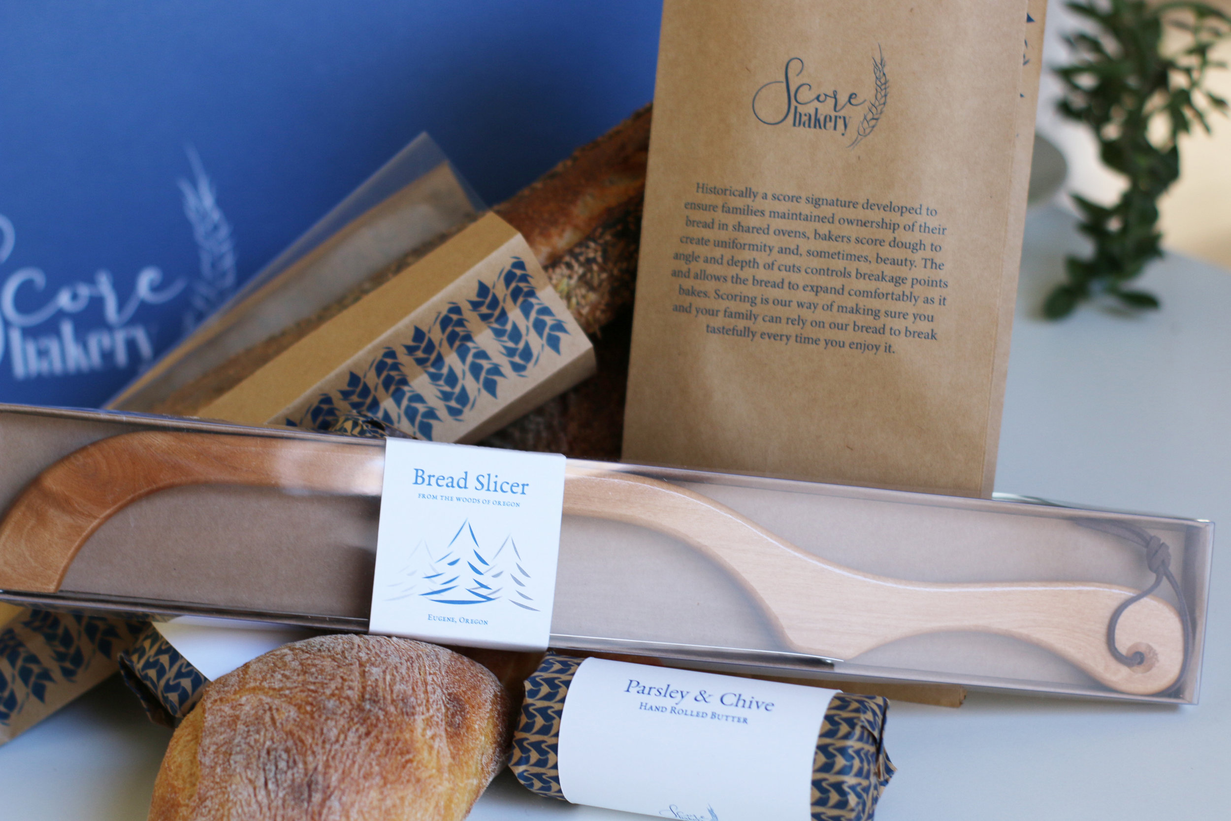
Reminiscent of a french style bakery, I incorporated a palette of white, blue, and brown paper for a simple, clean and appealing design. A pattern of wheat is applied throughout the packaging design to create a cohesive element among the products. A window on the bread sleeves intentionally showcases the scores of each artisan bread, emphasizing the rustic cuts in each loaf. The rolled butter is wrapped in printed brown paper and neatly fastened with a white band, intentionally designed so the small package of butter is visible in the subscription box among the bread. Designed purposely to display the craft and unique features of the specialty knife, the acetate and brown box packaging is rustic and refined while remaining functional.
Print, Branding, Vector Digital Files, Packaging, Template Design, Labels, Photography, Digital & Physical Craft


